Tackling the most common negative reactions to the Dolphins’ new logo
(via Facebook)
At last, the Miami Dolphins have confirmed their new logo (above, between Dan and Don) and, because I’m the worst type of person, I’ve spent a lot of time scouring through the reactions across different platforms of social media. As one might expect, those reactions have been varied. At times they’ve been outright absurd.
Here are some of the more generalized responses that I’ve come across:
“I’ve been a fan of the Miami Dolphins for 30 years but because of this new aesthetic will be switching allegiances or purging myself of professional football altogether.”
Out of all the myriad of egregious reactions, this one is my favorite. And my knee-jerk comeback is pretty simple: if your loyalty to a franchise rests solely on the look of the logo, then by all means, please see yourself out. You were never much of a fan to begin with and you’re giving the rest of us a bad name.
I’ve been a fan of the Miami Dolphins for more than 20 years. I learned to understand and love the game during Dan Marino’s prime and have since been dragged across the piping hot coals of a 62-7 playoff loss, a 1-15 season, and the likes of AJ Feeley, Brian Griese, Ted Ginn (and his family), and Cam Cameron. Dave Wannstedt coached in the aqua and orange for almost five seasons. In 2000, the Jets erased a 30-3 lead in the fourth quarter to come back and win 40-37. Indeed, Dolphins fans have had it rough. But if you’re still around, it stands to reason that it’s because of something much deeper than wins and losses and certainly much more important than a logo.
But, hey, your mileage may vary.
“I did a Google image search for ‘new Dolphins logo’ and found a couple hundred results, of which I’m going to attach my favorite and verbally assault you for not choosing it.”
I’m guilty of the Google image search thing myself. I’ve spent the past couple of months captivated by the possibilities for the team’s new look and have found a few concepts that I thought were worth bookmarking. Similarly, I’ve found some that made me cringe. But to think of these fan- and designer-conceived illustrations as anything more than internet fodder is just foolish. If you saw something a year ago on a stray blog and set your heart on it, you’ve long since set yourself up for disappointment.
More over, the chances that the one idea out of a thousand that you liked serves as the only viable option is self-centered and narrow-minded. There are a lot of really good — and really bad — options strewn across the internet. It’s not particularly fair to react negatively simply because the one you wanted wasn’t chosen.
“This logo isn’t intimidating enough!”
But any of the previous incarnations were?
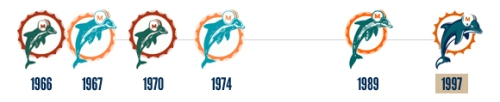
(via The Sports Design Blog)
That right there is a fairly basic timeline of logos used by the Miami Dolphins throughout their long, rich history. Can anyone point me to the time where the team had a logo that could even loosely be defined as “intimidating”? It has always been — and perhaps more importantly, continues to be — a dolphin swimming or jumping through a sunburst hoop. If anything, the Jimmy Johnson-influenced design that debuted in 1997 was the least ferocious emblem in the team’s history. A cartoon dolphin with a strapless helmet?
Even if you’re viewing this new logo as a missed opportunity to eschew the cartoon-ish doings of the past in favor of a chest-thumping, pissed off war dolphin, the worst case scenario is that the logo is just as fierce as any other in the team’s lineage. It might not be more intimidating, but it isn’t less. So what’s with the venom?
Besides, dolphins — you know, the kind in nature — aren’t scowling, menacing beasts that shoot fire from their undercarriages and slice through prey with razor-sharp tails. They are devilishly intelligent. They’re smooth, sleek, and graceful marine mammals. They thrive by virtue of their cunning, not by being volatile aggressors. A reasonable case could be made that the new logo is actually the best depiction of the creature the team is named after than any of its predecessors.
“No one likes this. Change it back.”
Actually, some people do like the new logo. Personally, I love it. I’d argue that more people don’t like being spoken for by some random dude on the internet than don’t like the new logo.
“It looks like an advertisement for an aquarium or an alternate logo for Sea World.”
Well, it’s a dolphin. The Indianapolis Colts’ logo looks like it could adorn the entrance to a horse track. The San Diego Chargers’ logo could be affixed to the back of an electric company’s utility truck. I just don’t quite follow the aquarium logic. The same kind of blanket thinking could be applied to just about any major sports team.
“I’m not going to buy any more merchandise and if the rest of us who hate this logo follow suit, they’ll have no choice but to change it back.”
Hey, it’s your money. I’m sure most of us can find more sensible ways to spend our cash than on a $30 white t-shirt with a logo in the center and Nike swoosh on the sleeve. But I wouldn’t cling too tightly to the expectation that refusing to lay down your credit card number for a fresh new jersey is going to force the team’s hand into yet another rebranding.
“Get rid of Nolan Carroll! That will make the logo better.”
Okay, this isn’t a generalized reaction. This is an actual quote plucked from the Dolphins’ Facebook page and I just thought it was funny.
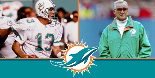
“Just because Dan Marino and Don Shula have made public statements in favor of the new logo doesn’t mean we should like it.”
You’re right. It doesn’t.
Here’s the thing: Stephen Ross is a multi-billionaire whose net worth checks in somewhere around $4 billion. He’s smart. Believe it or not, the folks that comprise the Dolphins organization are wise enough to understand that any big change will be met with derision. Change is scary. People get bent out of shape when McDonald’s alters their dollar menu. And so the Dolphins have begun an aggressive marketing campaign to “sell” the new logo to fans who they fully expected would express harsh negative reactions. Over the next month or so leading up to the official reveal of the new logo and uniforms on April 25, expect a whole lot more of this stuff as the team works to get the backing of their fan base. They’ve already handed out some new gear to Jared Odrick, whose been excitedly posing with it.
(via Twitter)
Marino and Shula are pitchmen here. They’re the two most recognizable legends the organization has and their words and opinions carry weight with fans of the team. No, you don’t have to agree with them. And yes, they were most likely paid or strongly encouraged to give favorable reactions. But that the inherent marketing built into rebranding something (a business, a sports team, whatever) become a point of criticism seems a bit silly.
“We don’t need a new logo. We need a better team.”
Comments like these are usually accompanied by suggestions that even computer operated teams in Madden would laugh at, like “trade our second round pick for RG3” or “go sign Calvin Johnson.” That level of craziness is an entirely separate issue.
Back to reality: if you lodged a complaint like this, do you mind sharing with the class where you’ve been for the past month? The Dolphins have gone out and completely renovated the roster on both sides of the ball, bringing in Mike Wallace, Brandon Gibson, and Dustin Keller to boost the offense and swapping out Karlos Dansby and Kevin Burnett for Dannell Ellerbe and Philip Wheeler, two players who will be paid equally but are younger and provide significantly more upside going forward. Obviously, games aren’t won in the off-season. No one can accurately judge these off-season moves — and the ones still to come (the team still has roughly $15 million in salary cap space with another $8 million or so to be freed up on June 1) — until November or December at the absolute earliest. But the implication that the team has neglected football matters in favor of style and design is simply not accurate.
Of course every fan wants their team to win. That’s the goal. That’s the priority. And Dolphins’ fans have seen roster overhauls like this that looked great in March and fell flat in October. But that the front office — specifically the much maligned Jeff Ireland and head coach Joe Philbin, who I trust implicitly — has been ignoring their primary duties in favor of deciding whether or not to make the new logo outline navy blue or orange is a blasphemous accusation to make.
If anything, the logo change is in conjunction with the roster revamp. If you believe what Ireland’s been trumpeting, this off-season is the end result of a long, calculated plan. And if the plan was to free up cap space to address multiple needs and stockpile draft picks to bring in the talent to make the team competitive for the next decade (in addition to procuring financing for massive stadium upgrades that could lure a Super Bowl in the next few seasons), then why not usher in this new era of Dolphins football with a fresh new aesthetic? Football organizations are more than capable of addressing multiple objectives simultaneously.
“I hate the new logo but I’ll always support my Dolphins.”
Now see? That’s better.
You don’t have to love or even like the new logo, but maintaining at least a somewhat reasonable perspective is important. There was backlash in 1997 when the Dolphins drastically altered the look of the team by adopting a new symbol and adding blue shadowing to jersey numbers, but we all lived to tell about it, didn’t we? We watched helplessly as Nick Saban and company chose Daunte Culpepper over Drew Brees in 2006, only to have Culpepper succumb to injury and Joey Harrington step into the starter’s spot. Sports Illustrated predicted the Dolphins would play in the Super Bowl that year, if you’ll recall. We didn’t fling ourselves off bridges.
Even if you’re disgruntled with the new look, this logo is far from being the greatest atrocity in the history of the franchise, which some of the reactions I’ve come across very plainly suggest. We’ve seen way worse. For me, it’s an exciting new start to an era that will hopefully be as competitive as the one I grew up with. There’s no accounting for taste and we’re all entitled to our personal opinions. But if you’re really a fan, you’ll find it in you to get beyond whatever disdain you may have for the logo and put your energy behind the team rather than against it.
